Communion of Saints Church Brand Development
& Launch
Brand Strategy • Logo Design • Identity Design • Art Direction • Social Media Design • Print Design
Overview
A local church needed a cohesive visual identity that reflected its mission and created consistency across digital and physical spaces. Working closely with leadership, I developed a complete brand system—from discovery and logo exploration to social media, web, and environmental graphics.
I began the project with a series of conversations focused on the church's values, vision, and community. Rather than beginning with visual trends, the goal was to understand how the organization wanted people to feel when interacting with the church.
Discovery



The Foundations
The identity was shaped through conversations with church leadership about the community they hoped to build. Every design decision traced back to a shared set of themes and values.
Core Ideas
The Trinity
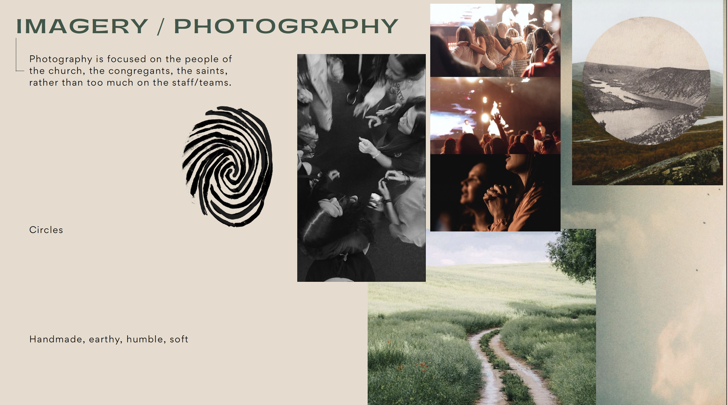
The church wanted the identity to reference the Trinity without relying on the familiar triangle. Instead, we explored circles as a symbol of unity, equality, and relationship.
The Table
One recurring conversation centered on the image of people gathered around a table where all can gather equally and share meals and life together.
Walking in the Dust
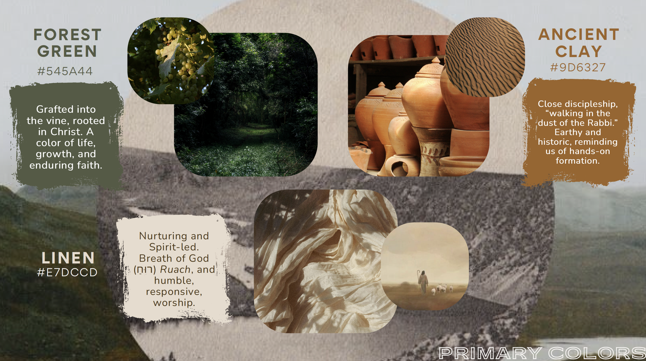
Leadership wanted the brand to feel humble rather than polished. We explored imagery rooted in worn paths, earth, handmade materials, and the idea of "walking in the dust of the Rabbi" as a picture of discipleship.
Past and Present
The identity needed to acknowledge the history of the Church while feeling relevant today. Rather than looking nostalgic or contemporary, the visual language balances both.

Identity Development
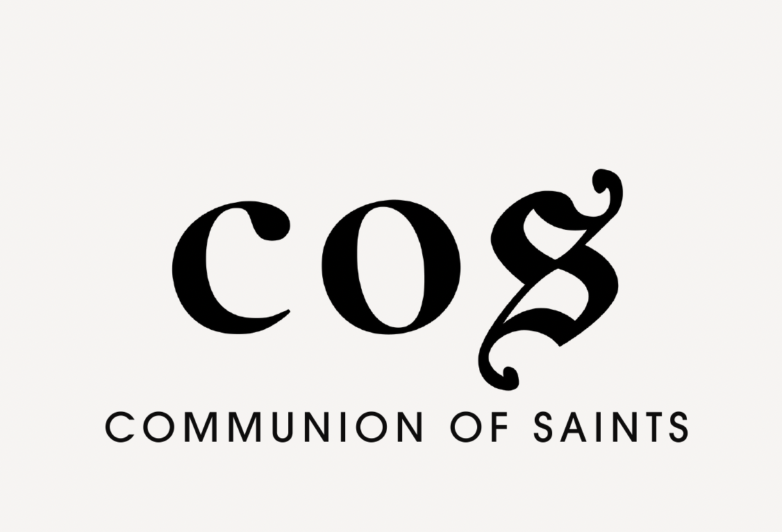
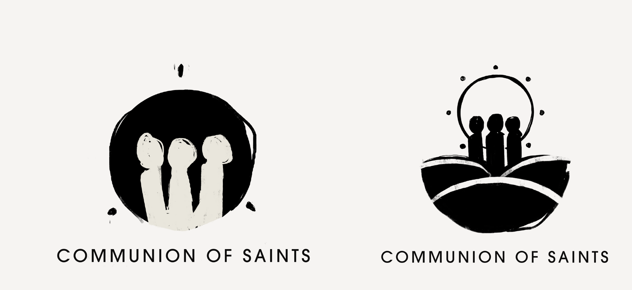
More than twenty logo concepts were developed to explore different ways of expressing these ideas.
Each round tested new relationships between form, typography, and symbolism before narrowing to a final direction through collaborative feedback.
Final Logo
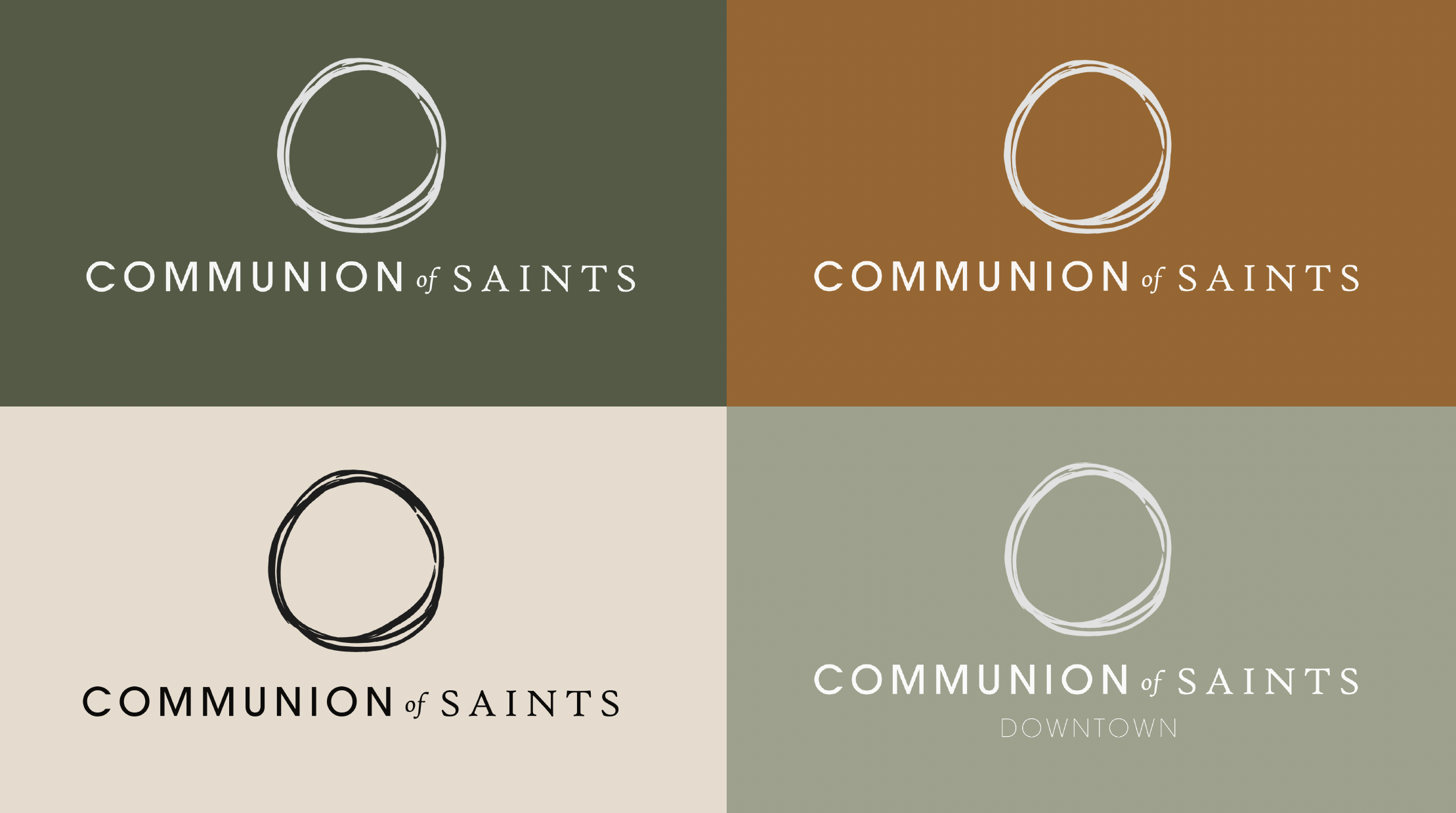
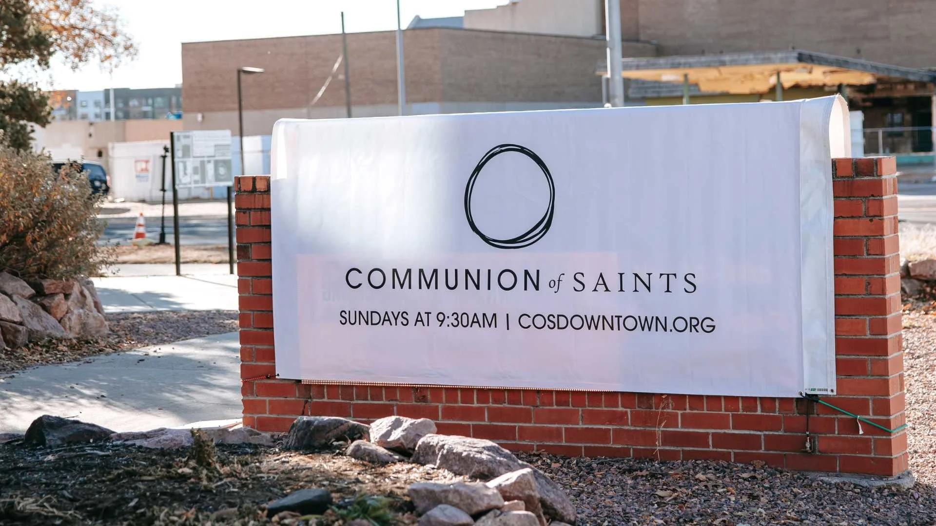
The final mark is built from overlapping circular forms drawn with imperfect, hand-rendered lines. The entwined circles suggest relationship, community, and shared life rather than the literal Trinity. The organic strokes reinforce the brand's emphasis on humility and authenticity while creating a symbol that remains recognizable across print, signage, and digital applications.
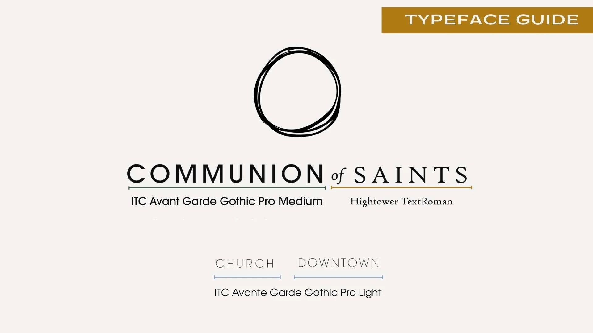
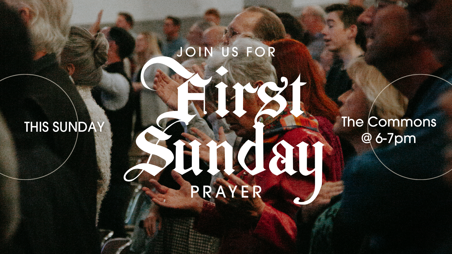
Circular forms became a recurring design element throughout the identity system, appearing in photography, layouts, icons, and environmental graphics to reinforce the themes of unity and shared community.